ColorVision Spyder2PRO and PrintFIX PLUS
Part I Spyder2PRO
The Spyder2 is a hardware monitor calibrator. It is placed on the monitor and through a series of user choices and monitor readings, it develops a calibration profile for the monitor. It can be purchased with three separate software packages as Spyder2express, Spyder2 Suite, and Spyder2PRO. The Spyder2's goal is to deliver "superb gray balance and tonal response, flawless shadow detail and highlights, accurate and true-to-life flesh tones, and picture perfect landscapes."
All three versions work with CRT and LCD monitors and laptop monitors. I tested the Spyder2PRO on a brand new high end Dell laptop with a Quadro card. The reason I needed to color correct the monitor was that there was a bluish tint to the screen and the Nvidia driver for the card on the laptop did not have any color correction capabilities under Windows Vista Ultimate.
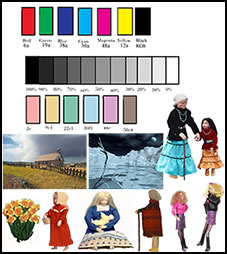
To make a long story short, the results were thrilling! I use a calibration set of images that I created many years ago. I remake it as necessary. One important component is the gray scale. Since the screen captures would not show the tint on other monitors, I created facsimiles for the review. Below are two sets of facsimiles: A before and after picture of my gray scale
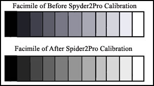
and a before and after picture from Spyder2's exit screen.
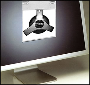
Here is what the Spyder2 looks like.

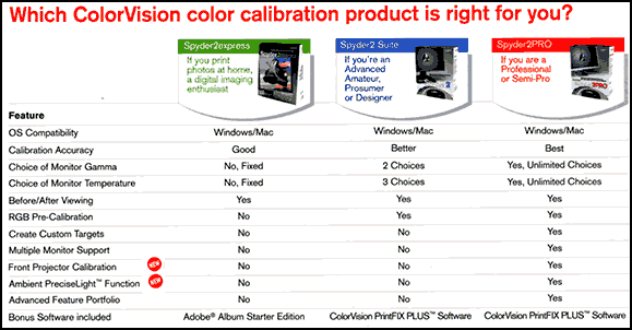
I mentioned different software packages; below is a screen, that I hope is legible, describing the differences. More information can be found at: http://www.colorvision.com.
The multiple monitor support does not work with Windows if you only have one video card.
Before I used the Spyder2PRO on my new Dell laptop, I used it on my old Dell under Windows 2000. All the screen captures for this part of the review are from there.
What are some of the variables that the Spyder2PRO software package allows the user to adjust or choose when creating a profile? Instead of listing the choices, I did screen captures of most of the screens in order of presentation.
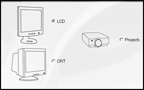
This first screen shows the choices I needed to make for type of monitor.
Next, I needed to choose a Target. Notice on the screen how the screen explains what elements are contained in a "Target". If that isn't clear, each screen comes with an additional help section that is excellent. Also, there is a PDF manual that is included and that is similar to the help sections but is altogether in one unit with a table of contents. It is very useful.
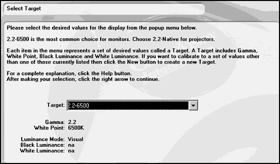
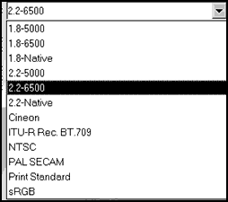
Below are some of the choices of targets.
For the next screen, which I need not show, I had a choice whether to have the Spyder2 measure ambient light. If I chose yes, then later in the process, it would measure the light in the room and adjust the profile accordingly.
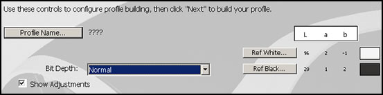
The next screen asked me how to select the desired Luminance Mode: Measured or Visual. In the process, I, also, elected to have Gray Balanced Calibration turned on. The finished screen, before the actual measuring was to take place, looked like the screen below.
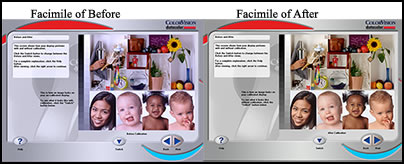
Once everything was in place, you leave the Spyder2 alone and various colors will appear on the screen. After you remove the meter, the before and after screen, as pictured above, will appear and you can see the difference for yourself.
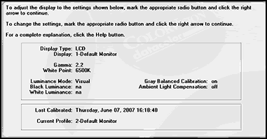
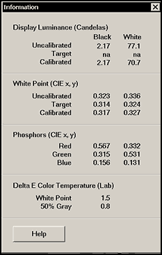
There are other tools you can use. There is a curve for analyzing color channel by channel and an Information window which allows the user to review information about the calibration and profile. There is also a Colorimeter window for reviewing the color performance of monitors. Below is a screen capture of the Information window after the monitor was calibrated.
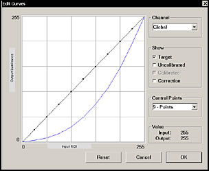
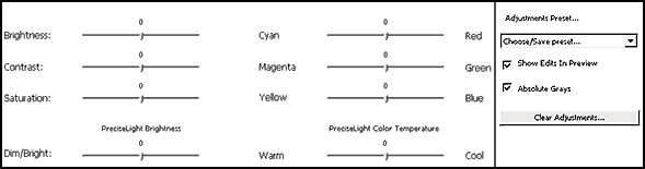
Lastly, one does not have to use only presets, one can create a target profile starting with a tonal response curve that can be edited according to color channels, for example. The examples below were just default settings.
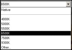
Then, one can choose a standard white point temperature.
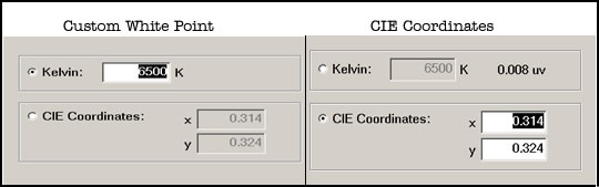
Or one can deal with custom white points through custom temperatures or CIE coordinates.
 .
.
As you can see, the Spyder2PRO version offers a lot of choices for creating custom monitor profiles.
I did not have the luck I had with my laptop LCDs with my CRTs. We have three machines: One with one CRT (my husband's) and two with dual monitors (all CRTs.) I started by calibrating the single CRT (not part of a dual setup). I tried creating profiles a number of times, each time having to remove it and a few times having to ghost back my C drive because while everything looked good color-wise, the hour glass and pointer always appeared green. The monitor never had previously appeared to be very much out of calibration nor did it ever have a green hour glass or pointer.
Next, I found that I could not calibrate my dual monitors on one PC so I had to match the second monitor by hand. You can only calibrate the primary monitor on Windows when you have multiples if they have a single card. You can, according to directions, calibrate both if you have a Mac, however. I hit a few rough spots when I encountered some screens stating there were errors after I had created the profile and I had quit the session, but by hitting OK, I was able to continue on and finish the session. One even stated that there was no information for the profile created. However, when Windows opened, it did load the profile.On Windows XP Pro, the icm profile can be found under Windows>System 32>Spool>Drivers>Color.
I, then, turned on my other set of dual monitors which remained calibrated by hand. I realized that they looked a lot better than the CRTs that I had calibrated with the Spyder2PRO. Part of the problem, other than the green pointer on one of the CRTs was that the basic image in the white areas ( on the monitor of the dual pair) was so bright that it hurt my eyes to look at the screen. I could not lessen this by just lowering the brightness of the monitor for, then, it compressed the darker ends of the gray scale. This was not the first hardware calibrator that I had found that did not do that good a job on my CRTs. I removed the profile and the program and went back to my original calibration. It is possible that I prefer to work with a slightly darker screen than do other people. While it was possible that I could have used more of the tools available, experimented with the curves, the white point settings, etc. to calibrate the one monitor of my dual monitor setup to my satisfaction, it was faster to do it by hand.
My criteria for calibration were: how well did articles I photographed match in color on the monitor and in print to the original, how neutral were my grays, and how well do my monitors match under different Windows systems?
While I cannot say everything is perfect, I can say that they meet my very critical standards even though my Epson R2400 prints slightly darker than I like. However, PrintFIX PLUS can handle any printing deviations. Look for Part II: A review of ColorVisions' PrintFIX PLUS coming soon.
I highly recommend the Spyder2PRO for use on laptop LCD screens, especially if they have the blue tint to them. It removes that beautifully and creates a grayscale that is very neutral and incrementally even.
Part II PrintFIX PLUS
PrintFIX PLUS is a part of the Spyder2PRO package as well as the Spyder2 Suite package.
My testing goal was to see if I could, in general, lighten a little my overall prints produced by my Epson R2400 printer. I use Photoshop CS3, formerly used CS2, and I use the profiles that come with the printer for my printing. While I was satisfied with the profiles, there were times when I felt that the prints were a little too dark.
PrintFIX PLUS works by using a basic profile provided by ColorVision. ColorVision stated that there were more profiles available on there web site than were contained in the software; however, I could not find them. For my Epson R2400 there were two profiles available: one for matte type paper and one for glossy type paper. These were to be used as generic profiles with all types of Epson paper. I tested the Matte-Art profile with Epson Enhanced Matte and the Gloss-Lustre profile with Epson Premium Lustre.
Once you choose a profile, you adjust the following controls and keep making proofs from these controls.
Both these two screens are actually one large screen.
The proofs are not cumulative, so it is a good idea each time you make a proof to keep track of the settings. You choose from Custom, Color, or Black and White. You have the choice of printing in quadrants to save paper or full screen. If you are using letter size paper, full screen is necessary.
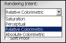
During the process, you can choose your rendering intent:
For my Epson Matte Enhanced, I found that a setting of Saturation -5 and Brightness +5 gave me the desired change. I tested it on my calibration test sheet, and I was satisfied. Even though the instructions suggest that you use intervals of 10, I found that intervals of 5 gave me more control. For my Epson Premium Lustre paper I, also, found those were good settings.
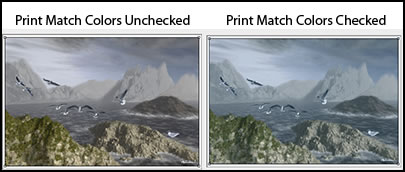
I discovered that this program had a lot of other good uses. I had created an image in Vue 6 Infinite and Photoshop CS3 that printed correctly according to its traditional Epson profile, but I wanted it a little cooler, lighter, and bluer. I created just the profile I wanted in PrintFIX PLUS. I, also, discovered that if you learn how to read the Match Print Color feature in Photoshop CS3, you can create profiles basically on the fly . I say "learn how to read this feature" because the tonal changes are very exaggerated. When printed, both images printed flatter in color. But the image with the new profile created in PrintFIX PLUS, the one on the right, definitely was not as strong a blue as the preview made it look.
Another way I found to add to the breadth of the program had to do with using two sliders in a different fashion than they were meant to be used. There are two settings that are used so that the prints will look good in specific light situations. They are the PreciseLight™ Brightness or the PreciseLight™ Color Temperature settings. Since I look at prints under varying light conditions, I did not use these settings. However, I found that I could use the latter as a different kind of control. If I reversed the "Warm" and the "Cool," I could control the coolness or warmness of the print on the paper. (Basically, I am reversing its intended use.) I could not control the coolness and warmness enough by using the color sliders when I wanted to make changes that went beyond matching the image on the monitor with that from the printer. This is not a fault of the program because I was going beyond the basic purpose of the program which is to create a profile so the image from the printer is printed correctly assuming the monitor is calibrated correctly. As I stated above, what I could do by reversing the warm and cool on the PreciseLight™ Color Temperature is set the coolness or warmness and, then, give it a final tonality.
In summation, I was able to take the base profile in PrintFIX PLUS and change it slightly to create slightly lighter prints on the two papers I tested. Now, instead of having to change an image if I want to change the tonality, for example, of a print, I can easily create a new profile. The PrintFIX PLUS system gives me complete control of my prints.
For a list of PrintFIX PLUS supported printers click here.
Requirements for Spyder2Pro are:
- CRT, LCD, Laptop Display
- Windows 2000, XP, Vista and higher
- Mac OS X 10.3 or higher
- Powered USB Port
The cost for the Spyder2PRO which includes PrintFIX PLUS is $249. But you can get it for less at retailers such as Adorama.com and Amazon.com among others.
If your main interest is PrintFIX PLUS, the cost for the Spyder2 Suite is $169.00 and it includes PrintFIX PLUS.
For information on ColorVision products, go to their web site.