RGB and CMYK Colors
I have written a number of articles on color over the years. This is updated as of 7/4/05. I started working in the field of graphics before color profiles even entered the arena. I remember when many programs such as Adobe Illustrator used manual calibration to calibrate one's monitor inside a specific program. I wish many of these programs still had that as an option because many pre-packaged profiles simply don't work. For example, I have two Viewsonic Professional Series P95 f monitors and two P95 f+ monitors. None are exactly alike. This is normal for a monitor. Thus, if I only used a pre-packaged profile and didn't tweak each a little differently, it wouldn't do me a lot of good. And as the monitors age, their color will change. To create a correct profile, I would have to use special equipment and I do not mean just the color calibrating software that comes packaged with many monitors.
Let me first state something that is unfortunately true. The same printer or scanner with the same driver version on different operating systems will produce different colors. This is a real problem. For example, I had my Epson 1280 adjusted under Windows 2000 to my satisfaction. No matter what I do, it will not interpret color correctly under Windows XP.
Here is how I use the tools available to me at home to calibrate my monitor. This method has worked for me for years even though it has changed slightly as the programs have changed. I will use Photoshop CS2 to demonstrate. However, this works in other programs since it is program independent. I am working in RGB. However, at the end of this discussion, I will note some facts about my experience with CMYK in this home type of environment.
The first step is critical. One's monitor must be able to produce a neutral gray screen. Here is a way to tell. If you use a PC, don't use fancy wallpaper; go to property>appearance>desktop>advanced
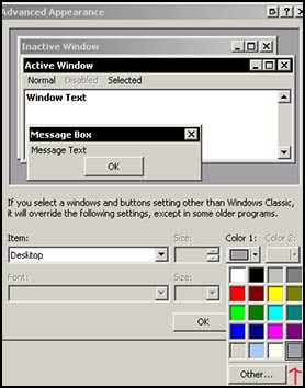
To know if the gray is correct, get an outside source like a photographic 18% gray card or any medium gray card that is an absolutely neutral gray. If your screen is not neutral gray, your colors will always have a cast to them. If you need to correct your screen, use either software that came with your monitor or with your video card. I am not talking about calibrating your monitor; all I am recommending is that you make your monitor screen a neutral gray. Once you do that, the colors should line up properly. At least, I have never known them not to unless your monitor is over bright or over dark, or just plain bad.
This is not scientific. After years of doing this, I can tell in my gut what I need to do. These are just hints I am sharing to help you get there. I cannot tell you if your monitor is too light or too dark. We all work differently. That is why we choose different profiles. The same color profile will appear differently on different monitors especially if the brightness levels are different. Having the light in your room at a medium brightness and not shining directly on the monitor is important also. And keep it consistent.
I will detour and speak about light now since it will be important soon. Light is many difference colors. Daylight has more blue in it than does a normal incandescent light bulb. When I am looking at color swatches, for example, I am looking at them under a medium light and near my monitor which projects a different light. There will be some difference in color between the swatches and those on the monitor because of the reflectivity of the printed paper and the differences in light. However, the difference should be minimal. If I were working near a window, there would be another difference in color. If you look at a print under a regular light bulb, it will look reddish. Under some fluorescent, it will look green. If there is a black and white grayscale in it, the gray should be a neutral gray under mixed light - daylight plus incandescent. I have found that at home the best way is to take a print or anything that is in color and look at it near a window as well as a table lamp. We are neutralizing the light to some degree. Again, we are not being scientific, but I have found this method produces good results. Learn to look at colors and see how they change with lights.
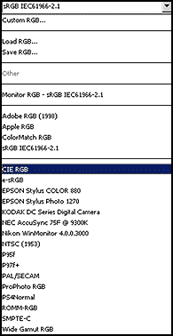
Once your monitor is a neutral gray, then you can go into your individual programs and choose a color space to work in. In the last two versions of Photoshop, I have used the same RGB color space, sRGB IE 661966-2.1. I have found that this space most accurately represents my colors on my screens with the way I have set up my overall monitor, i.e., intensity of light and neutral grayness of screen.
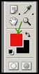
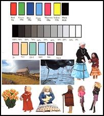
I have created a montage of images as reference. This montage is comprised of Trumatch swatches and pictures of objects I have at home as well as two images I created. I made the little boxes, referenced them with a swatch color. In Photoshop I double clicked on set foreground color and then clicked on color libraries.
 |
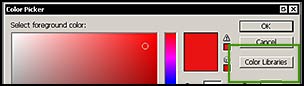 |
From there I accessed the Trumatch library. Once there, I typed in the letters and number like 6a for red and
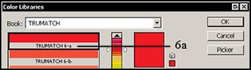
proceeded from there. I could have used Pantone or any library where there was also a separate book of swatches. The gray scale was just a matter of typing in 100%, 90%, etc. using grayscale as my color mode.
Since I am not working with a service bureau and needing to produce color separations, I work in RGB mode and leave the setting for CMYK according to the program's, in this case Photoshop's, default.
To decide on the appropriate RGB color space, it is important to turn off embedded profiles at this point even if you decide to use them later; if you don't, your images will not change in color as you change RGB profiles. I then checked all the profiles available in Photoshop and compared them to the swatches and the colors of the other external sources I was using as a test base.
I kept a list of the ones that most closely resembled the swatches as a whole. It is important to use mixed colors (not just red, cyan, etc), those under the gray scale, and the objects as well as the Red, Green, Blue , Cyan, Magenta, and Yellow because I have found that it is harder to tell the saturation level of the RGB, CMY colors if they are the only ones used and that can make a difference. When I first started, I only used those colors and then when I went to print, the colors were not correct. It was because of the saturation levels. A color that looked OK on the screen could be too saturated and overpower another. Usually what you will find is that one color might be off a little and in trying to fix that by choosing another profile, others will then be off. So go with what looks best as a whole on your monitor using the swatches as well as all the objects.
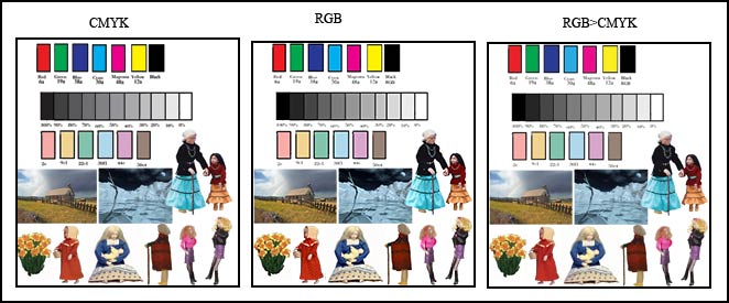
While I did all the above testing in RGB, I took a blank template and made sure it was in CMYK color mode. I then went through the process of filling in the swatches in CMYK mode and brought in the bottom images which converted them from RGB to CMYK. I looked at them on the screen beside an RGB test and an RGB test that I converted to CMYK. (The images of figures and pictures were all originally created as RGB so even in the document created in CMYK mode, those images had to be converted when copied and pasted.)
All the color and gray scale bars in first image to the left were created in CMYK mode. The bars in the middle image were created in RGB mode, and those on the far right were created in RGB mode and converted to CMYK mode. A screen capture was taken of each image. There were no embedded profiles.
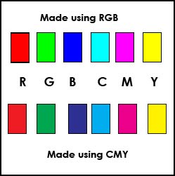
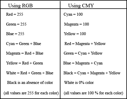
Next we need to look at the relationship between the different colors and what they mean. The relationship between Red - Green - Blue and Cyan - Magenta - Yellow with K being for Black is often hard to understand. Both color spaces are interrelated.
| Created in RGB Mode | Created in CMYK Mode |
|---|---|
 |
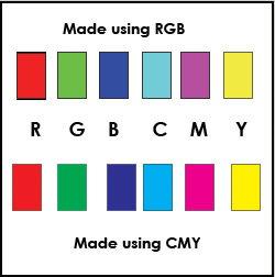 |
Notice how no matter what mode you are in, the colors created using CMYK percentages will always appear the same.
When you create colors using RGB, as you add them together you get white. When you remove all color, you get black.
In the chart below, assume that for RGB, when you are creating new colors, you are adding together 255 of each color. In the CMY(K) section, you are adding 100% of each color to create the new color.
However this is all theoretical. In the real world, this does not happen this way and that is part of the problem and confusion about colors. Click on Sample #1 and Sample #2 to see screen captures from Photoshop CS2 mixing palette. These were created in RGB mode.
RGB colors are colors from light - think in terms of the light from your monitor while CMY colors are colors from ink - think in terms of a printer. In light, if you add Red, Green, and Blue together you will get white light. The absence of all colors is black. Whereas in CMY, it is a building up process, Cyan, Magenta, and Yellow added together create Black (dark mud brown) and when all are taken away, you are left with white. Since the back is not really black, we add Black (K) to our CMY printing colors.
In very simplistic terms and without going into any scientific explanations, one works in an RGB (light ) space eventually using CMYK colors if the documents are to be printed. If the mode is RGB or CMYK, one is still using printer (CMYK) colors if the end result is printing. The web has other problems, which I will not even try to discuss here because this is a discussion of RGB and CMYK color modes and not Indexed color.