Good composition is essential for an photograph to be artwork and not a snapshot. Unfortunately in my teaching experience I have seen it ignored in the last few years. I don't know if it is because of the ease of use and popularity of the digital camera and free sites where people can upload scores of images and your friends can ooh and ah over them whether they are actually good or not. By good I am not referring to the trend that everything is "good" or "subjective." I am speaking about the intermixing of composition, emotional impact, lighting, color or lack of it, etc. I have purposely left out subject matter because that can be subjective. Some people like landscapes; some don't. I am speaking about what creates a technically and artistically good image. This does not eliminate abstract work.
Here are some of my pet peeves:
- Subject might be interesting but the background detracts from the subject.
- The main subject is bullseyed.
- The depth of field does not work with the image.
- There is no emotional impact to the image. Happiness or a feeling of lightness is an emotional response.
- The image is poorly exposed or printed.
- The image is worked "to death" in an image editing program.
- Parts are out of focus that shouldn't be.
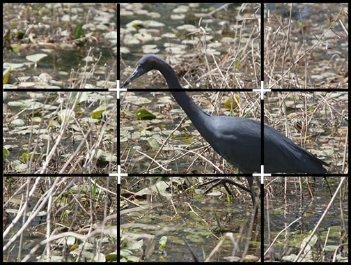
- Keep the rule of thirds in mind. This is the easiest composition tool. Some digital cameras even have the ability to bring up this grid. Look at the four intersecting points. Those intersections are the main powerful ones.
- Notice how there is less space behind the bird than in front of it. Don't have an image trailing off the picture unless you have a compositional reason.
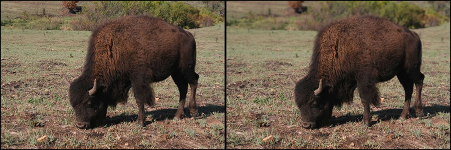
- Notice depth of field (dof). Usually if there are prominent subjects, the background should be slightly soft or out of focus. Above the edges are out of focus with the background the most "fuzzy." If you haven't taken an image where the whole image is in focus, programs that create Bokeh are useful such as Alien Skin's Bokeh 2. Other programs such as onOne's Focal Point will allow the user to manipulate dof. You can also do it in Photoshop using filters with or without layer masks. Below, the background has been blurred in the image on the right to make the buffalo more prominent and the background less chaotic. I purposely left the foreground sharp because he is using it for his dinner.
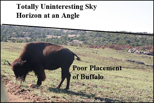
Below is a main image placed directly in the center. In addition, the sky is totally uninteresting. This picture could be saved (I don't know why it should be, but it could be) by at least changing the sky for another one or adding clouds using a third party filter.
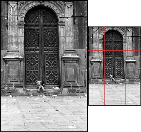
Here is an example where the figure was centered horizontally. It is not an exact bullseye. I did this because I wanted the symmetry of the cathedral to show. Here is a case where I believe breaking the rules was necessary.
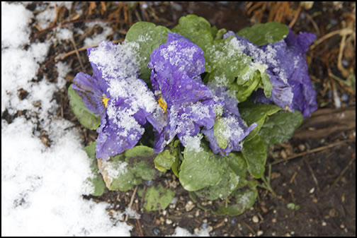
Another hint is not to have large uninteresting areas in an image unless there is an artistic reason. Here the whiteness of the snow causes a distraction. Bright areas cause the eye to notice them. While the flower with the ice crystals could be said to be interesting, the surrounding area intrudes, and, without cropping, the flower is centered too much.
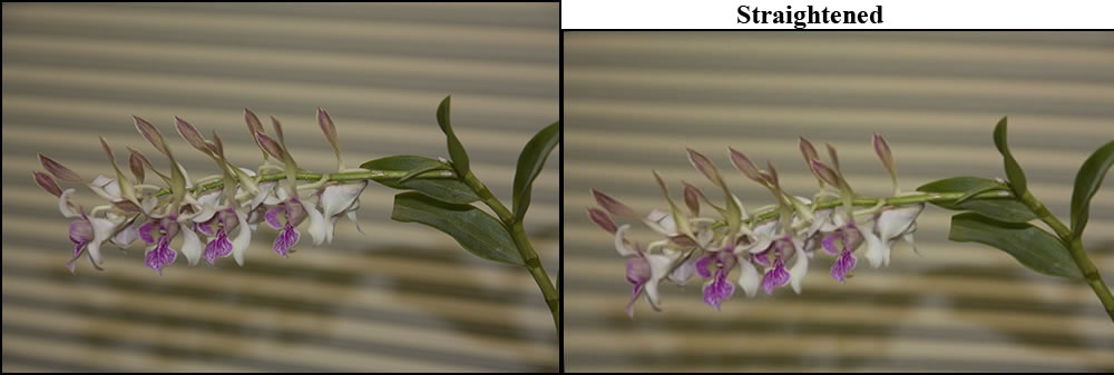
Here is an example of how the background is distracting. Notice how the horizontal lines are at an uneven angle. The background totally distracts from the flower. This can be somewhat corrected in Photoshop using the Warp tool. Even straightened, the lines are distracting and the lighting is poor. With work, this image could be salvaged.
Quantity doesn't necessarily equate with quality. Be your own harshest critic!