|
In response to my articles on Printing Isn't an Island,
I became aware that maybe I should share my methods of
ensuring good printing results. So I am trying to outline
them in as direct a sequence as I can.
1) I use Epson printers. I have found they are the most reliable
color wise. For "Fine Art" printing I use the 6
ink models such as the Epson Stylus Photo 870, the 1270, and
the 1280. I have seen the 2000P and have heard excellent comments
on the 2200.
2) I try to work under uniform lighting conditions. My computer
room uses daylight flourescents and I look at my output under
a combination of daylight and tungsten light.
3) I insure that the overall color of my monitor is balanced.
Without color calibration software or hardware tools, one
after a while, just knows when the RGB colors are balanced.
I have nothing against software or hardware calibration devices,
I just have never used them. I, also, try to print from one
program only. I use Photoshop 7 for this. I set up my controls
in Photoshop 7 so that I have two ways to test both the monitor
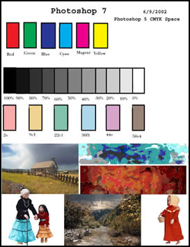
and the printer. I use outside swatches such as Trumach or
Pantone and create my own Calibration Card. (This should be
familiar to people who have read some of my other articles.)
This I, initially, use to make sure the colors on my monitor
resemble those from the swatches. I choose additive colors
and subtractive colors such as Cyan and Red as well as mixed
colors or blends. I also photograph objects I have around
the house and put in a grey scale strip.
4) Once I have this Calibration Card on the
screen, I open the Color Presets under the Edit menu and start
to set it up. I start with the default and go from there.
I try to use default settings when possible because it just
makes life easier. I learnt a long time ago that the profiles
for brand of monitor, printer, etc. meant nothing. In the
past, I have had to set up these type of screens with other
programs, not Photoshop, reflecting hardware that I didn't
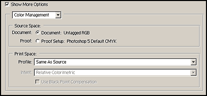
even own to create accurate color representation. I do not
use Color Management Policies because I have found that since
I do not trade files I have more control and flexibility if
I turn these controls off.
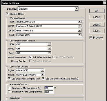
Once I have chosen the settings in Photoshop that best mirror
these outside sources, I am ready for the next step - the
Printing of this Calibration Card. Which is the second tool
I use to ensure my printing is accurate.
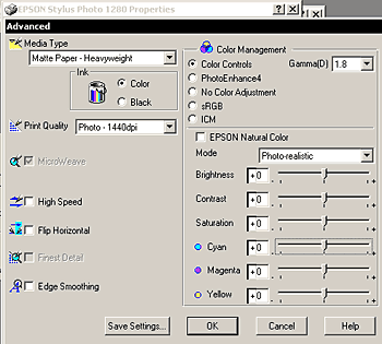
5) I use the following settings for my Epson 1270 or 1280
printer. The settings will vary between printers. I have used
similar settings for many generations of Epson printers. If
the colors or grey scale are not accurate, I start to manipulate
the mode of printing. Next I try different settings in Color
Management. In actuality, I have never had to change the Mode
or the Color Management settings.
Most typically, the colors will look good, but
the grey scale will have a cast to it. Here is where knowing
the relationship between additive and subtractive colors comes
in handy.
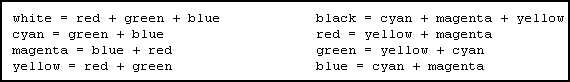
Also, it is very useful to know the complementary
colors.
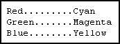
6) Once I see the cast, I start manipulating
the Cyan, Magenta, and Yellow sliders always keeping the above
two charts of relationships in mind. I print examples until
am satisfied.
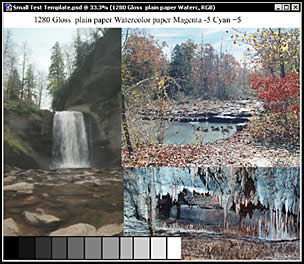
7) I, then, take another Calibration chart that
I have created with other images and a grey scale and see
how it looks on the monitor and make a print of it.
8) The following are other settings that I use.
These are from Print-Preview under the File Menu.
Of course one needs to start out with a good
file whose resolution is adequate. I have written various
articles on Resolution. Some can be found on my website
and some on Renderosity's under Featured
Columns since they have already ben published on the first
page.
|