|
While I wrote this article a few years ago for
a class I was teaching, I have found people still refer to
it. Thus, I am including it and updating it. Of all the How
to Use Graphics articles I am including on this web site,
this one had to be changed the most because monitors, programs,
and video card technology have improved radically in the filed
of color as well as in the field of software color calibration.
Color management is probably one of the most
frustrating areas for many people. Since I do not work on
Macintosh computers, I will not address them in this discussion
nor will I go through a Ahow
to calibrate your system as a whole@
because each system is different and each user=s
goals are different, also. I will, however, share some of
my own experiences on various systems and programs. Hopefully
this will be helpful.
While I know this will annoy some authors, I
have read many articles on color calibration and, perhaps,
in a prepress house, they are valid. However, I have found
them extremely confusing and necessarily tedious. I have been
using Epson Color Stylus Photo printers for years. I have
an Alps printer, as well, that I use for certain effects.
In the past, I never had trouble with my outcome if the particular
graphic program either could be manipulated manually. Recently,
with the advent of Photoshop 6, I have not had any trouble
at all just leaving the settings generic.
The three components that should agree with
each other are the input devices such as scanners and digital
cameras, output devices such as printers, and of course, the
monitor. The monitor can be calibrated with a hardware calibrator
or visually or through pre-packaged software, or hardware
created profiles. Basically, input and output devices
can be calibrated through profiles or visually. Each of these
components will be addressed individually.
Years ago, when I first started in this field,
I wanted to know what standard I needed to use in order to
calibrate my monitor. I called service bureaus and pre-press
houses and they told me that I needed to know the final output
device. When I told them I didn=t
know what I would be using, they basically told me that they
couldn=t help me.
Thus, I designed my own system which I have found works. I
work in RGB space and do not worry about CMY color separations.
Since I am not designing for others, client=s
colors are not an aspect that concerns me nor do I have to
match a particular output device that is connected to someone
else=s machine.
Most professional level graphic programs allow one to select
printers=s profiles
and a service bureau can further instruct the designer on
what color modifications they must make.
When calibrating a monitor, the following
specifications can be gotten from the manufacturer: The color
temperature of the picture tube, the x and y values for the
RGB values of the picture tube=s
phosphors, and the gamma of the monitor. Some monitors already
have a profile integrated into the program. While this sounds
complicated, it is and it isn=t.
While I hate generalizations, I have found that monitors today
display color fairly accurately provided that there is a good
video card in the computer. Also, monitors and/or video cards
usually have ways to calibrate the screen image. A good monitor
and the video card do not usually cause the problems in calibrating
one=s monitor. Usually
the cause is the individual program that is being used and/or
lack of understanding of how color works on the part of the
user. A few graphic software versions ago, one could calibrate
one=s monitor visually
within the particular graphic program. One could change the
values of blue, red, cyan, etc. within the program itself.
(This would not cause a global change as does calibration
using monitor or video card calibration.) One could either
compare this to an outside source or to the output of one=s
printer depending on the software program. When I wrote this
article, initially, I found the following statement to be
true that too many programs come with built in profiles for
the users to select to theoretically calibrate their system,
and in my personal opinion, that is where the problems occurred.
However program versions since the year 2000 have been much
better in the field of color calibration. The default settings
are usually pretty good for the home user.
Other conditions, also, influence color visualization
and, thus, output. Firstly, assuming that one has two identical
systems with equal room illumination, no two monitors will
show colors the same. Secondly, as monitors age, the phosphors
change, the picture tube gets duller and colors change. None
of this is a large problem if one has calibration hardware
or if it is built into the video card or monitor itself.
Scanners, printers, and digital cameras don=t
usually come with advanced software programs for calibrations.
Some flatbed scanners do and some programs have setups for
scanner calibration. Many printers have a minimal set of options
to change color output.
Another aspect that must be taken into consideration
is the light under which one is working and the light under
which the picture will be viewed when printed as hard copy.
When transmitting images over the web, different browsers,
computer systems, etc. become a factor, also. Many graphic
software and web image generating programs allow the user
to preview how the image will look under different conditions
such as under a Windows or a Macintosh system environment
or when using different color palettes.
My goal is to be able to use any printer
regardless of its particular quirks. I need to know that the
color on my screen will not only print as seen, but is, also,
"correct" and can match some type of color standard.
For this purpose I have chosen to use Trumatch color swatches
as my standard. However, Pantone swatches or any others for
which a CMYK color formula is available will work fine. One
can purchase these at graphic supply store, through mail order
catalogs, and at some service bureaus. A package costs around
$65.00 to $85.00
The following method I have found has worked
for me as I have changed computer systems, programs, video
cards, printers, and monitors.
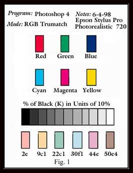 1)
I make boxes on my screen and fill them with 100% colors for
Cyan, Magenta, and Yellow. I have coated swatches from Trumatch
that correspond. (I can also do this from the color library
in Photoshop since all the swatches are numbered and have
equivalents in the Photoshop library.) The key is to have
an outside source. I work in RGB space not CMYK color space.
In other words, I set my mode to RGB. 1)
I make boxes on my screen and fill them with 100% colors for
Cyan, Magenta, and Yellow. I have coated swatches from Trumatch
that correspond. (I can also do this from the color library
in Photoshop since all the swatches are numbered and have
equivalents in the Photoshop library.) The key is to have
an outside source. I work in RGB space not CMYK color space.
In other words, I set my mode to RGB.
2) Next, I make boxes and fill them with
Red, Green, and Blue. I also take these formulae from Trumatch
swatches.
3) I next make a series of boxes and fill
them at 10% intervals starting with 100% Black and ending
with 0% Black so that the first box is filled with 100% Black,
the next with 90% Black, etc. For these fills, I make sure
that Cyan = 0, Magenta = 0, and Yellow = 0. The only variable
manipulated is K or Black.
4) I, then, make more boxes and fill them
with color blends, once again, taken from my swatches.
If the colors on the screen match the Trumatch
swatches that I have used taking into account ambient (room)
lighting and the difference between the monitor's RGB color
space and the printer's inks that use the CMYK color model,
I, then, print my results on the paper type I will be using
for the majority of my work using the corresponding printer's
setting. Often, at this point my job is done. If the colors
on my screen do not match, I try to correct them. How one
does that depends on the program being used and the hardware.
If I can manually tweak, color value, monitor
gamma, etc., I usually can achieve a good result. The biggest
problem occurs when all one has to work with are prepackaged
hardware profiles. What I have discovered is that I eventually
can find a combination of hardware that works even if I do
not own the hardware. For example, in one major program, I
had to invoke the profile of a separation printer that I did
not even own so that the colors on my screen matched my outside
source and the printed output matched this outside standard
as well. Again, this did not occur with the programs that
I used that were released since 2000.
I review software for major manufacturers,
and, thus, have used most of the major products over the past
few years. The system I have outlined has worked on most of
the major software image editing, painting, and drawing programs.
Earlier I mentioned ambient room light and
how it can affect the viewed hard copy. I work under daylight
fluorescent lights. I, also, often view my work under tungsten
light. The color values of my work will appear different.
The critical factor is not a number, but to know that there
is a difference and to understand this difference when working.
To see my work, I usually set it under a
tungsten light near a window. This gives me a combination
of light since I do not know how the work will always be viewed.
Related Articles:
|